Designing and engineering a portfolio that behaves like a product
This site is a live case study in full-stack product craft: information architecture, design tokens, motion systems, interaction design, and persistent visitor data. Instead of documenting process after the fact, I implemented process directly into the artifact. Built with Astro 5, Tailwind v4, GSAP, and Cloudflare Pages + D1.
Context
Problem framing: portfolios are often legible but low-signal
Most portfolios optimize for output listing, but under-represent decision quality. I wanted the site to communicate systems thinking before anyone opened a resume: how I scope constraints, build design primitives, and ship interaction details with engineering rigor.
Success criteria were straightforward: maintain clear navigation, preserve fast interactions on lower-end devices, and create a distinctive voice without reducing readability.
Process
I shipped this in four iterative passes
- Pass 1 - IA and narrative: define top-level routes and page roles so each section had one primary job.
- Pass 2 - Design primitives: establish color tokens, typographic scale, spacing rhythm, and motion constants.
- Pass 3 - Interaction layer: prototype and tune the floating dial, section reveals, and onboarding micro-states.
- Pass 4 - Product depth: implement the Remembering Shelves feature, letting visitors see their presence persist across sessions.
Constraints
Design decisions were filtered through explicit constraints
I worked with three hard constraints: 1) no decorative pattern should hide key content, 2) all non-essential motion must degrade cleanly, and 3) custom navigation must remain faster than a standard top nav in practical use.
That yielded a repeatable rule set: expressive aesthetics at the visual layer, predictable structure at the interaction layer.
System architecture
Tokenized styling plus route-level composition
Visual rules live in tokens.css, while page assembly happens
through reusable Astro components and shared layout wrappers. This split kept style
iteration fast and prevented one-off CSS from leaking across sections.
I mapped accents to route families so color reinforces wayfinding, and I standardized
interaction timing around a single spring curve,
cubic-bezier(0.34, 1.56, 0.64, 1), to prevent a patchwork
motion profile.
Interaction model
The floating dial is a UX and engineering tradeoff
I replaced a top navbar with a persistent floating dial to reduce header clutter and keep destination switching within thumb reach on mobile. Closed state minimizes visual weight; expanded state reveals labeled wedges with active-state feedback.
Engineering cost was higher than a standard nav, but controllable: GSAP handles transition
choreography, and focus/keyboard behavior is explicitly managed to keep interaction
predictable. The component also supports
prefers-reduced-motion handling so the effect remains inclusive.
Implementation details
How behavior is engineered, not just styled
- Progressive reveals: sections animate in only when entering viewport, with an automatic fallback reveal to avoid hidden content states.
- Motion safety: reduced-motion paths bypass animation and render complete content immediately.
- Data flow: visitor interactions are persisted server-side in Cloudflare D1 and reflected in shelves experiences.
- Component boundaries: page-level narrative stays in route files, while interaction primitives live in reusable UI/navigation components.
Feature depth
Remembering Shelves: persistent visitor memory
Instead of a one-off participatory loop, I built the Remembering Shelves feature: when a visitor returns, their presence and shelf are remembered and visually surfaced. This turns the site into a place with memory, not just a static gallery.
Visitor data is stored in Cloudflare D1 and shelf state is animated with CSS view transitions for a tactile, low-latency reveal.
Personality & play
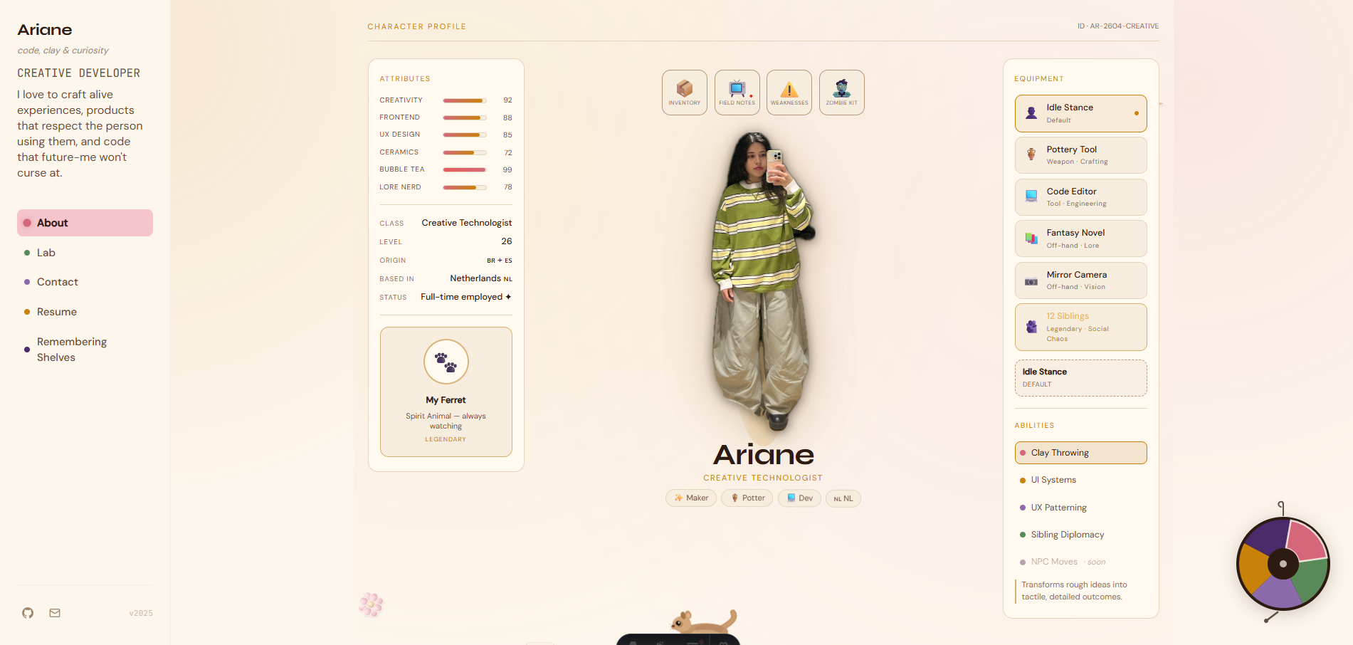
The interactive About Me page: playful self-portraiture
To make the About Me page more than a bio, I filmed myself making a series of poses, then turned those frames into digital stickers. Visitors can interact with these stickers, rearrange them, and discover playful states. This process required both creative direction (choosing poses, editing for clarity and personality) and technical work (image processing, drag-and-drop, and stateful UI feedback).
The result is a page that feels alive and personal, inviting visitors to linger and play—showcasing both my technical range and willingness to experiment with self-representation.
Outcome
Designer/engineer outcomes from this build
This project demonstrates end-to-end ownership across product framing, UX architecture, design systems, frontend implementation, and backend-backed interaction features. The portfolio itself now serves as a maintained shipping surface, not a static archive.
For design collaborators, it shows process discipline and visual direction control. For engineering collaborators, it shows component boundaries, progressive enhancement, and practical performance/accessibility tradeoffs in production code.
Case evidence
Concrete artifacts from this build
These references capture practical decisions behind the portfolio: information hierarchy, dial navigation behavior, and the shelves completion experience.


- Primary deliverable: a production portfolio engineered as a continuously shipped product.
- Technical emphasis: architecture decisions, shared tokens, motion orchestration, and persistent visitor data.
- Experience impact: stronger memorability while maintaining clear wayfinding and readable content hierarchy.