av. — TV Optimization Studio
A case study on designing a calm, opinionated decision tool for media buyers at dentsu.
Role: Product design + frontend engineering
Client: dentsu (internal platform)
Stack: Next.js 15, TypeScript, shadcn/ui, Tailwind, Recharts, Azure AD (OBO), Azure Functions
Status: Shipped to internal trading teams
1. Context
Dentsu's Dutch trading desk plans hundreds of millions of euros of TV inventory every year across distributors like Ad Alliance, Talpa, and STER. Buyers used to drive the optimization engine through a Jupyter notebook and an Excel companion: a stack of cells, hard-coded parameters, copy-pasted GRP outputs, and a separate deck for the client.
The math was excellent. The interface around the math was the problem. A single brief — "€750k in May, focus on 25–59, no late night, max GRP" — could take 20 minutes to translate into the right cell values, and scenarios could not be compared without rebuilding them by hand.
The brief I gave myself: turn a notebook into a studio. Make the first 60 seconds feel like writing a sentence to a smart colleague — not configuring a model.
2. Business purpose
| Job to be done | Before | After (av.) |
|---|---|---|
| Translate a client brief into model inputs | Manual, prone to misreads | Ask av. parses a sentence into typed chips (budget, month, audience, exclusions) |
| Run optimizations across strategies | Re-run a notebook per strategy | One panel, five strategies (Single Best, Multi-Select, Allocation, Constrained, Timeband) |
| Compare and defend a recommendation | Rebuild scenarios in Excel; screenshot into a deck | Pin Scenarios A / B / C, see deltas side-by-side, export |
- Time-to-first-recommendation: target under 60 seconds from brief to ranked plan.
- Scenarios per pitch: from ~1 to 3+ comparable plans without extra effort.
- Trader confidence: every number on screen is traceable to a parameter and a constraint — no black box.
- Governance: server-side On-Behalf-Of auth keeps the optimization API behind Azure AD; no function keys ever touch the client.
3. Users
- Power trader. Knows every distributor's quirks. Wants keyboard-first control, locks, and constraints. Tabs straight past hand-holding.
- Account lead / planner. Owns the client conversation. Wants to type a sentence, get a defensible plan, and open a comparison view in front of a client.
The design has to serve both without forking the UI — one screen, progressive depth.
4. Design principles
- Monochrome canvas, one hero color. Pure white surfaces, near-black ink (
#05051E), and a single dentsu purple (#8C6BEC) reserved for the one thing on screen that matters right now. - Conversation before configuration. The first input is a sentence box (
Ask av.), not a form. Power users tab past it; new users get an on-ramp that maps to the same underlying state. - Progressive disclosure, never hidden depth. Constraints, timeband locks, distributor minimums — all collapsible, all reachable in one click. No settings menu, no second screen.
- Numbers are typography. Results use a display typeface at large sizes with a faint "ghost" number behind each metric card. Charts borrow the same six brand data slots so the eye links a color to a distributor across pie, table, and delta view.
5. Key design decisions
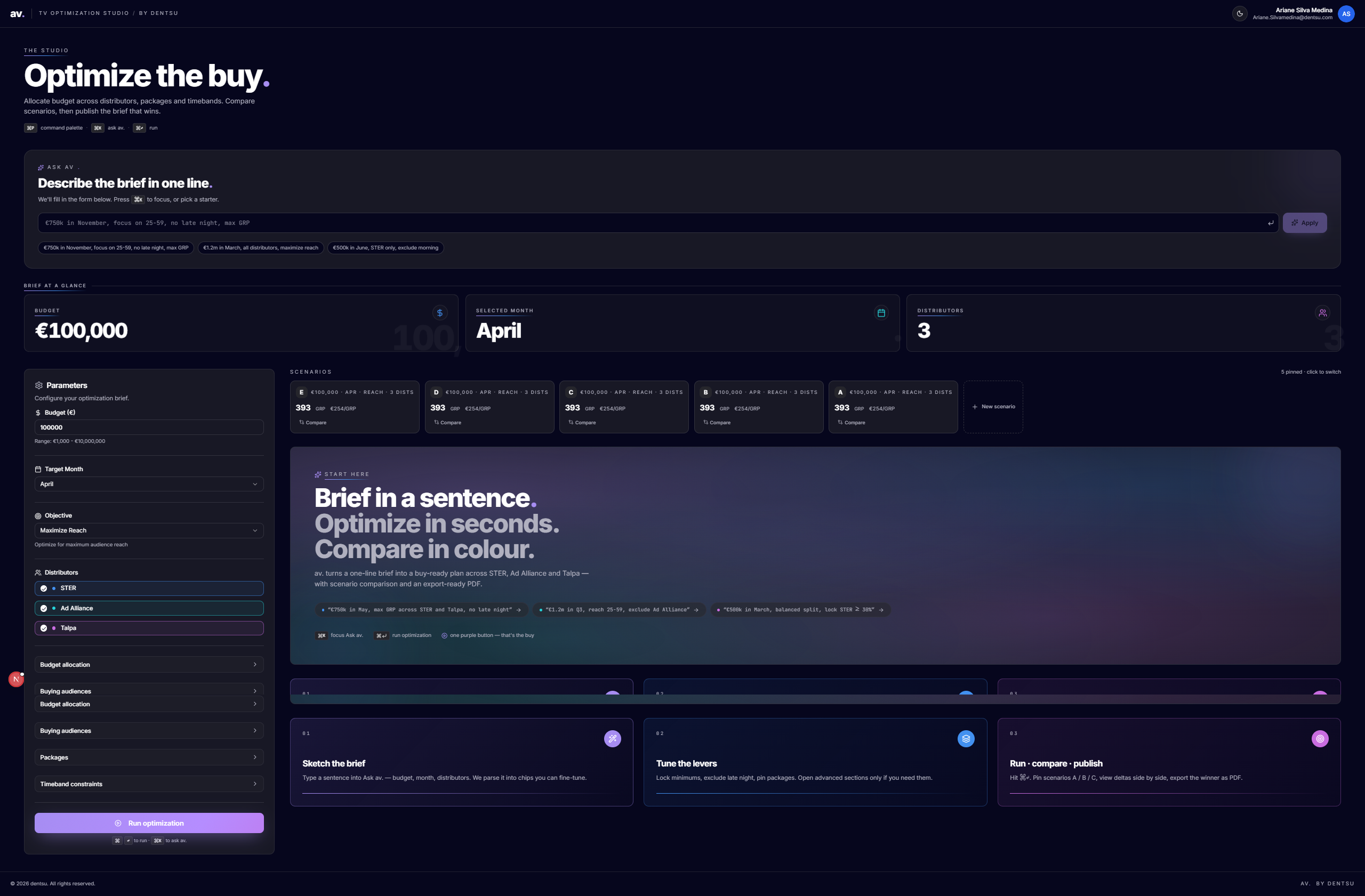
5.1 Ask av. — the conversational entry point
A single input that parses natural-language briefs into typed chips in real time as the user types. The chips are the source of truth — submitting hydrates the form below.
- Demo-friendly without being a gimmick: chips fall back to the form, never replace it.
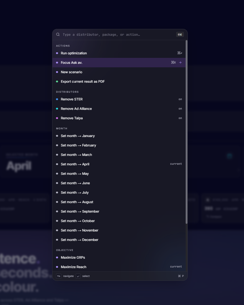
- ⌘K focuses the input from anywhere; starter prompts seed it from the Quick Start guide.
- Power users tab past in one keystroke; the form below is fully usable on its own.
5.2 Scenarios as first-class citizens
Every run can be pinned as a scenario (A, B, C…) with an auto-generated label derived from its diff against the baseline ("+€100k", "Talpa locked ≥ 30%"). The compare view shows GRP, price-per-GRP, and allocation deltas side by side.
5.3 Five optimization modes, one mental model
Single Best · Multi-Select · Budget Allocation · Constrained Allocation · Timeband Constraints
Each mode is its own component but shares the same input grammar (budget, month, distributors, audience). Switching modes never resets the brief. The mode picker reads as a continuum from "give me an answer" to "respect these rules."
5.4 Design tokens, not ad-hoc styles
- --ink, --ink-muted, --surface-2 for the monochrome scale
- --accent (purple) — the only hue allowed outside data viz
- --data-1…6 — six dentsu spot colors, used in charts, badges, and scenario chips
- --motion-fast / --motion / --motion-slow paired with a single --ease-brand cubic-bezier
A dark mode falls out of the same tokens for free, with the accent gently lifted so it survives on a near-black canvas.
5.5 Motion as feedback, not decoration
Three durations (120 / 220 / 480 ms) and one easing curve. Hover lifts, magnetic buttons, and scroll reveals all share the same vocabulary, so the interface feels like one object responding rather than a collection of widgets.
5.6 The header as a brand statement
av. wordmark + TV optimization studio / by dentsu in tracked-out small caps. It positions the tool as a studio, not a dashboard — which is the posture I wanted traders to adopt while using it.
6. Technical choices that shaped the design
- Next.js 15 + Server Route Handlers so the OBO token exchange happens server-side. The client never sees credentials, which let me design the UI without "sign in to API" interruptions inside the flow.
- shadcn/ui + Radix primitives so accessibility (focus rings, keyboard nav, ARIA on dropdowns and dialogs) was free, and I could spend time on the parts that are actually the product.
- Recharts + Plotly side by side — Recharts for the in-page summary cards (fast, themed), Plotly for the deeper allocation explorer where traders zoom and hover.
- Hydration-safe header — browser extensions inject DOM around the header; the component renders a stable placeholder server-side and swaps in after mount. A small thing, but it killed a class of "tool feels broken on first load" complaints.
7. What I'd do next
- Save briefs as templates — repeat clients have repeat shapes; the parser already understands them.
- Inline rationale — a one-line "why this plan" generated from the active constraints, anchored next to the headline GRP.
- Multi-market — the token system is ready; the parser and distributor list need localization.
8. Takeaway
The hardest part of this project wasn't the optimizer or the auth flow — it was earning the right to be the simplest screen in the trader's day. Every design decision was in service of that: monochrome so the answer stands out, one accent so the next action is obvious, conversation first so the model meets the brief instead of the other way around.
A notebook tells you what the model thinks. A studio tells you what to do next. That was the whole job.